
Switch to
Light Mode

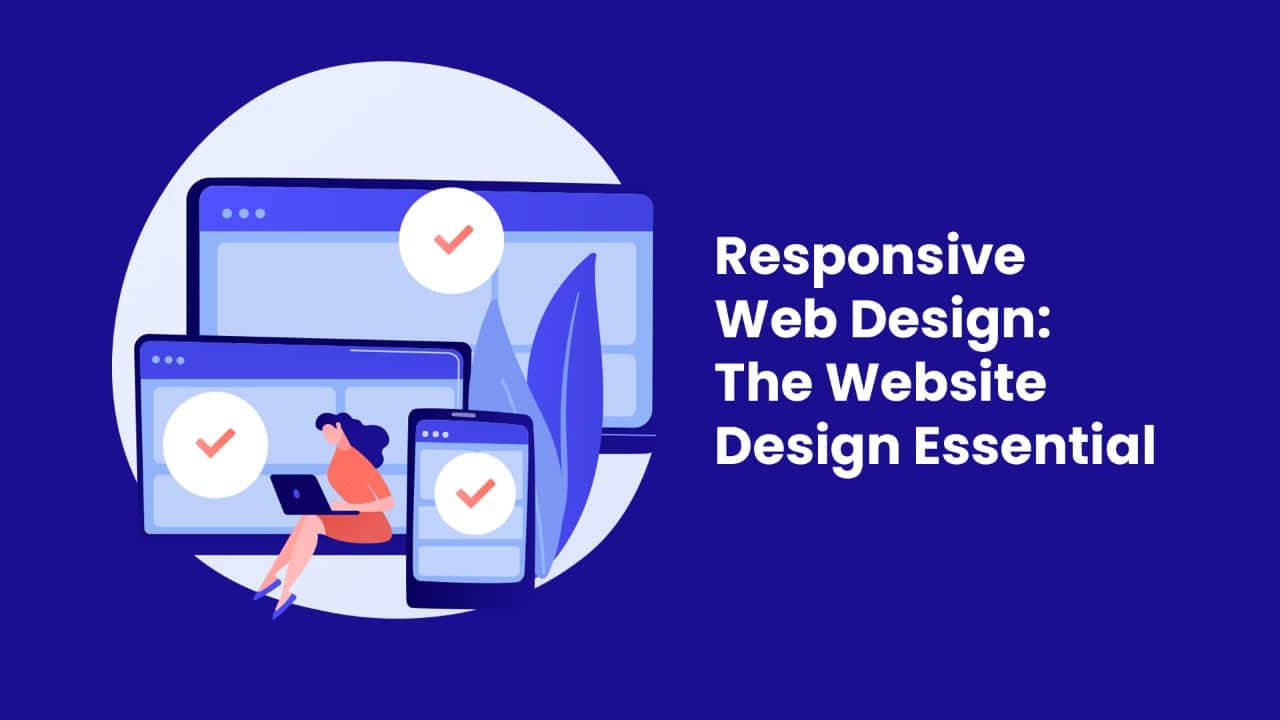 Working in the Responsive Web Design dimension of technology is actually fascinating. That essentially is what every website owner wants today. Whether we use the iPhone, iPad, or even laptop, Macbook, or conventional desktop, we do need the same results. This is where Responsive Web Design plays a role. Often clients consult for our web design services Dubai to upscale the entire look of their website or mobile app – and in short – it has to be responsive.
If you are a new website owner or have an outdated website, then this is something you need to know. If you are a budding web designer, then make sure that you have bookmarked this one from us. Being one of the top web development companies in the UAE, we keep up with the trends. Our experience has shown us that the right web design can keep your customers happy. Let’s just dive in to see what this is all about.
In the World of Web Design, in the past, simple website development and design were done. Depending on the screen resolution that the client specifies, the design would be formulated. However, today, the same website needs to be seen across so many gadgets. For this, the conventional web design is not sufficient. That is how web design technology was upgraded.
Responsive Web Design is a technological and highly creative approach whereby the website will switch its size and shape as per the device used. For instance, you can see our website smarthatch.com on desktop and mobile or Ipad with ease. This automatic resolution change is what created a proper Responsive Web Design approach.
When handling the web design for websites of any kind in Dubai and the UAE, our team makes sure to add these essential Responsive Web Design elements to our work. That is what reaps in the result and turns our credibility.
Imagine being overgrown into a small sized suit and feeling odd and stuffed in it. That is a similar feeling that you would experience if you witness a website that has not been made responsive. Once you load such a website, it gets stuck and half the content (be it the images or the literature) would be displaced or not seen. The experience is so unsatisfying and in most 99% of the case, people would get out of the website. In terms of your Google rankings, that is definitely not considered a good sign. So, instead the web design experts UAE will convert the backend design framework to blend into every gadget that uses it.
This way, the entire website or the mobile application will flex and shape up as the screen size that the device demands. Every element that needs to be displayed will remain intact.
We know that a lot of devices are being rolled out into the market every year. So, each screen resolution will differ. So, as a web design company, we have always ensured that our clients in Dubai get their websites in portrait, quite a few times –they get square shaped, and landscape screens. In fact, according to this, the technological orientations also will differ. If you take a look at most of the advanced smartphones and gaming apps, the way the games resize automatically is fascinating to watch. Have you ever thought about how we handle also these varied situations?
Of course, we design the screen resolutions for each of the pages, so that the loading is perfected. Our designs are made flexible to match the browser and the device that it reaches each time. The task is more complex than saying, but that is the Responsive Web Design experience we deliver.
Just like the screen size is made flexible, the images that are put into the website are also made flexible. Often the original image will be much smaller or large than the device screen. The web designer has to think about the visible image space and set the image to fit 100% screen space. The images become fluid this way and the final outcome makes the images look lovely.
While dealing with IE, often experienced web designers are more careful, as some very outdated browsers and devices may not be able to load the images, If you set the image resolution to 100%, that would help the image to be responsive to a large extent.
Did you know that the iPod and the iPhone have an inbuilt technology to rescale images as per their screen size? At one glance, that is very convenient with the iPhone Simulator. However, many designers around the world noticed that even if the website was made responsive, sometimes, the simulator would still function, and make the websites look all disoriented.
For this, the right tags for Apple products are used. This will stop the device from resizing the image on its own. Then the design code can be applied with perfection for the Responsive Web Design process.
Okay, today of the website designs are made sleek. Only the most essential information or content is displayed. The rest will stay stacked inside or hidden. That will help to proportionally shrink the content in the most professional and elegant manner. Keeping the varied mobile environments in mind, we have infused the Responsive Web Design concept in the most focused manner.
A simple walkthrough of our portfolio can showcase how we work on this aspect. The content will look clutter free, directional, and enhanced navigation. This keeps the website viewer more focused on the information they are seeking from the page. So, in a proper Responsive Web Design approach, the content should be rearranged to add comfort to the user experience.
We have seen smartphones that have touch screens and older versions too. Now, you never know who is using your website or mobile app. So, make your Responsive Web Design to suit both of these users. It should respond to both types of end users. So, whether they are using an older styled desktop or the modern one, the functionality should be smooth.
By being Responsive Web Design, we ensure to add smooth navigation and help the user to find their path through the pages. This is a custom made feature of quality websites that have a sensible responsive design in the background.
You may be why this is necessary and we will stress the fact that it is essential today. If you look around, most people, children are on the move and have smartphones for their day to day activities.
So, they will naturally opt for a website that can be seen clearly on their small resolution smartphone. If it gets difficult to load or the page looks broken, that is a negative mark. Here, 99% of the time, people will bounce out of the website. For instance, if you ask for an eCommerce website development in Dubai, we ensure that it is delivered with a Responsive Web Design. This is because your shoppers will be using their smartphones more often. So, to be with them, you need to upgrade and grow your sales.
According to data compiled by the best web design company in Dubai, mobile devices accounted for approximately 52% of all internet traffic worldwide in the fourth quarter of 2017. With more than half of all web traffic coming from mobile devices, it’s clear that you can’t go without an adaptable website. Find out how many people are visiting your site from mobile devices and how long they are staying. The next step is to develop a mobile-friendly layout and evaluate the results. When your website is responsive to the width of the user’s browser window, you will see a rise in mobile traffic and a lengthening of the average time spent on the site by mobile users.
Better usability is achieved through a responsive web design. User engagement, as measured by how long people stay on your site, is a key indicator of user experience quality, according to website design services Dubai. If customers have to pinch and zoom all the time to see what they’re doing, they won’t stick around your site for long. If your site is responsive and adapts to the size of the user’s screen, however, they won’t have any trouble using the navigation tools or completing forms. Because of this, people will have a more satisfying experience when visiting your site and end up staying longer.
A direct corollary of the preceding premise is simplified website upkeep. If you have two versions of your website, you and your team will have to divide your attention and resources between the two. With a responsive website, your team will be able to devote more time to higher-value activities like marketing, customer service, A/B testing, content creation, and more.
To know where your traffic is coming from and how they are engaging with your content, you need to track two sets of website analytics when you have two separate versions of your website. As a result, you’ll need to monitor a wide variety of sites and stages—including signup forms, thank you pages, conversion goals, and sales funnels—in order to succeed. In contrast, maintaining a single set of data is far less complicated using a responsive site’s web analytics.
A responsive website will load faster on all platforms, but notably mobile ones. The time it takes for a page to load is drastically reduced by using responsive graphics and fluid grids, which directly affect the number of seconds a user spends on your site. If a mobile page takes more than three seconds to load, 53% of users will leave the site. Similar studies have found that faster-loading websites see increased engagement and sales. This demonstrates how crucial it is to have a website with a responsive design.
Another benefit of responsive web design is that it helps websites rank higher in search engines. Since April 2015, Google uses how responsive your website is as one of the signals that determine where your website ranks on the search engine results page. If your site isn’t responsive, a lot of big search engines will put it lower on the results page. If your website passes the mobile-friendly test, search engines will put it in higher places.
We are into the 2023 walk and the days are not far away when technology will be your point of business. Make sure that your eCommerce websites, educational or even corporate websites are upgraded to the best format. Secure your design codes in a Responsive Web Design way and keep on par with the competition that indeed gets harder every day. If you feel confused about where to start your websites in Dubai, just send us a message. We will reach out and showcase where the design and development services need to be fitted appropriately.
